-
Playground를 이용한 UI 프로토타입 설계iOS Swift 2020. 9. 9. 18:51
Swift 에서 스토리보드를 이용해 앱을 구현할 경우 SwiftUI의 장점 중 하나인 프리뷰를 이용할 수 없다. 프리뷰를 이용해 UI를 설계할 경우 스토리보드 보다 빠른 속도로 구현할 수 있고 구현을 바로 프리뷰를 통해서 확인할 수 있다. 이런 장점을 스토리보드를 사용하지 않고 Playground에서 Live view를 통해서 비슷하게 개발 시 이용할 수 있다. 특히 스토리보드 없이 코드로 뷰를 설계할 때에는 해당 구현을 바로 실제 설계에 반영할 수 도 있다.
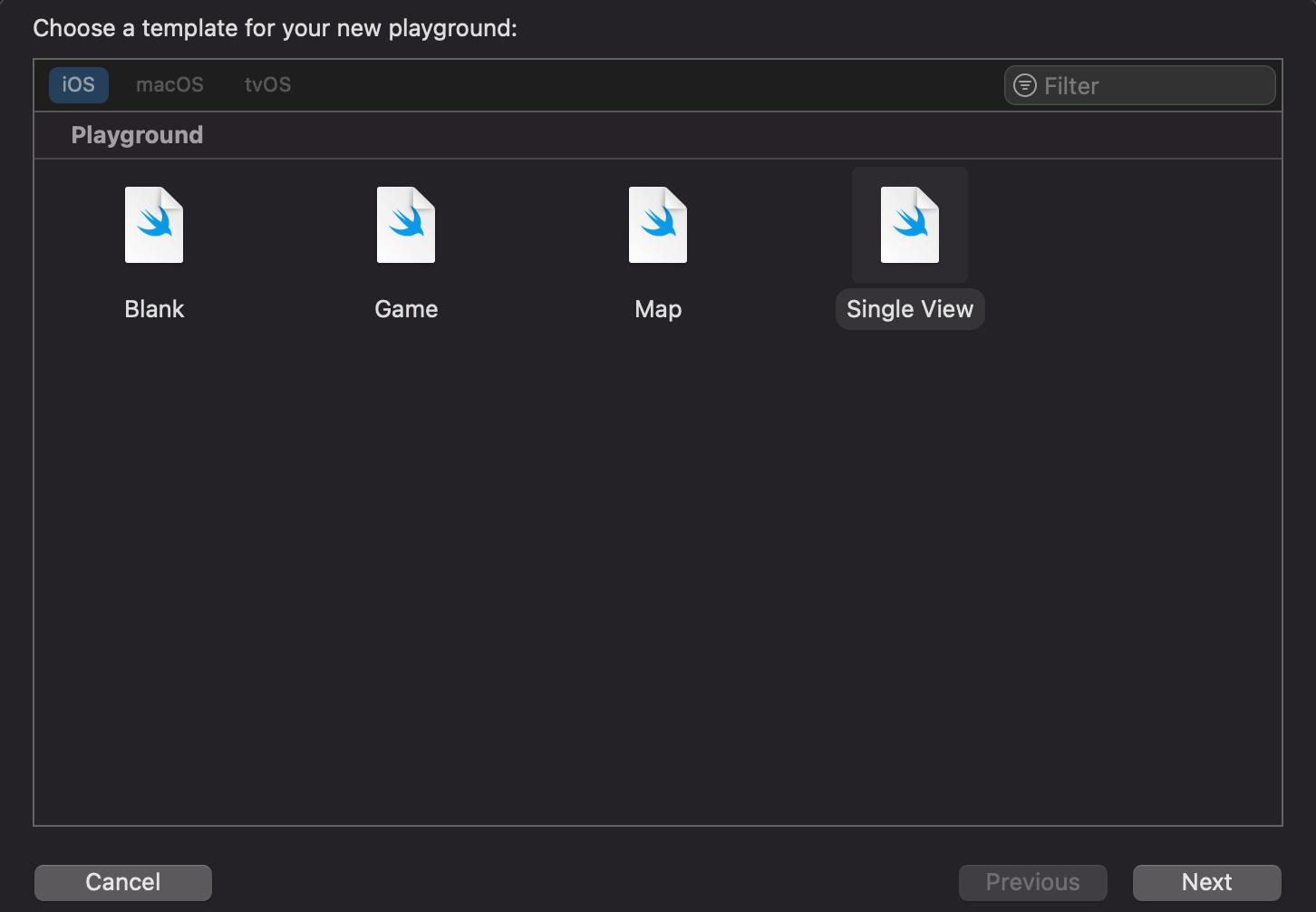
프로토타입 구현을 위해 우선 새로운 플레이그라운들 생성하는 데 Single View를 선택한다.
생성된 파일은 UIViewController를 상속받은 MyViewController 클래스가 뷰에 Hello world!를 표시한다.

우선 loadView() 내부의 코드 중 UILable과 관련된 코드를 지운다. 카드를 표현할 UIView와 백그라운드 이미지를 위한 UIImageView, 타이틀을 위한 UILabel을 추가한다. 카드 뷰에 백그라운드의 이미지로 사용할 Cover.jpg 파일을 Resource 폴더로 이동시킨다.

이제 viewDidLoad()를 재정의해 각 컴포넌트들의 AutoLayout으로 정렬하고 플레이 버튼을 눌러 현재까지 구성된 화면을 확인한다.

AutoLayout을 코드로 사용하기 위해서는 UIView 객체에 translatesAutoresizingMaskIntoConstraints을 false 값으로 설정해야 하고, 설정된 constraint에 대해서는 isActive를 true로 설정해야 한다.
    //cardView의 auto constraint를 설정하기 위해서는 translatesAutoresizingMaskIntoConstraints
    //를 false로 설정
    cardView.translatesAutoresizingMaskIntoConstraints = false
    //cardView는 top 위치에서 y 축으로 120 이동
    topConstraint = cardView.topAnchor.constraint(equalTo: view.topAnchor, constant: 120)
      //이 constraint가 설정되기 위해서 isActive를 true로 설정
      topConstraint.isActive = true
    //왼쪽, 오른쪽 constraint를 부모뷰와 동일한 값으로 설정
    leadingConstraint =  cardView.leadingAnchor.constraint(equalTo: view.leadingAnchor, constant: 30)
      leadingConstraint.isActive = true
    trailgConstraint =  cardView.trailingAnchor.constraint(equalTo: view.trailingAnchor, constant: -30)
      trailgConstraint.isActive = true
      //높이 constraint 설정
    heightConstraint = cardView.heightAnchor.constraint(equalToConstant: 250)
    heightConstraint.isActive = true
다음으로 카드뷰에 탭 제스쳐을 추가한다.
 override func loadView() {
    ...
    let tap = UITapGestureRecognizer(target: self, action: #selector(cardViewTapped))
    cardView.addGestureRecognizer(tap)
    view.addSubview(cardView)
    self.view = view
  }

  @objc func cardViewTapped() {
    descriptionMode = true
    updateUI()
  }

  private func updateUI() {
    print("updateUI")
  }
이제 updateUI 에 탭에 따라서 카드 뷰가 이동하도록 애니매이션을 추가한다.
  @objc func cardViewTapped() {
    descriptionMode.toggle()
    updateUI()
  }

  func updateUI() {
    UIView.animate(withDuration: 0.7, delay: 0, usingSpringWithDamping: 0.7, initialSpringVelocity: 0, options: []) {
      if self.descriptionMode  {
        self.topConstraint.constant = 0
        self.leadingConstraint.constant = 0
        self.trailgConstraint.constant = 0
        self.heightConstraint.constant = 300
        self.cardView.layer.cornerRadius = 0
        self.coverImageView.layer.cornerRadius = 0

      } else {
        self.topConstraint.constant = 120
        self.leadingConstraint.constant = 30
        self.trailgConstraint.constant = -30
        self.heightConstraint.constant = 250
        self.cardView.layer.cornerRadius = 0

        self.cardView.layer.cornerRadius = 14
        self.coverImageView.layer.cornerRadius = 14
      }
      self.cardView.layoutIfNeeded()

    }
  }
여기서 중요한 점은 화면의 레이아웃이 변경되도록 self.cardView.layoutIfNeeded() 를 호출해 주어야 한다는 점이다.

카드 뷰가 상단으로 이동하면 페이지에 대한 상세 내용을 보여주도록 descriptionLabel을 추가하고 alpha 값을 이용해 뷰가 상단에 있을 시 아래 화면에 상세 내용을 보여주도록 수정한다. 추가적으로 상단에 카드뷰 가 위치 시 닫기 버튼을 추가해 닫기 버튼을 누를 시 화면이 중앙으로 이동하다록 수정한다.
 func updateUI() {
    UIView.animate(withDuration: 0.7, delay: 0, usingSpringWithDamping: 0.7, initialSpringVelocity: 0, options: []) {
      if self.descriptionMode  {
        ...
        self.descriptionLable.alpha = 1
        self.closeButton.alpha = 1

      } else {
        ...
        self.descriptionLable.alpha = 0
        self.closeButton.alpha = 0
      }
      self.cardView.layoutIfNeeded()

    }
  }
전체 구현 코드는 아래와 같다.
//: A UIKit based Playground for presenting user interface import UIKit import PlaygroundSupport class MyViewController : UIViewController { let cardView = UIView() let titleLabel = UILabel() let coverImageView = UIImageView() let descriptionLable = UILabel() let closeButton = UIButton() var topConstraint : NSLayoutConstraint! var leadingConstraint : NSLayoutConstraint! var trailgConstraint : NSLayoutConstraint! var heightConstraint : NSLayoutConstraint! var descriptionMode = false; override func loadView() { let view = UIView() view.backgroundColor = .white cardView.backgroundColor = .white cardView.layer.cornerRadius = 14 cardView.layer.shadowOpacity = 0.25 cardView.layer.shadowOffset = CGSize(width: 0, height: 10) cardView.layer.shadowRadius = 10; titleLabel.text = "플레이그라운드를 이용한 프로토타입" titleLabel.font = UIFont.systemFont(ofSize: 20, weight: .semibold) titleLabel.textColor = .white coverImageView.contentMode = .scaleAspectFill coverImageView.image = UIImage(named: "Cover.jpg") coverImageView.clipsToBounds = true coverImageView.layer.cornerRadius = 14 closeButton.backgroundColor = #colorLiteral(red: 0, green: 0, blue: 0, alpha: 0.5) closeButton.layer.cornerRadius = 14 closeButton.setImage(#imageLiteral(resourceName: "Action-Close@2x.png"), for: .normal) closeButton.addTarget(self, action: #selector(closeButtonTapped), for: .touchUpInside) closeButton.alpha = 0 descriptionLable.text = "플레이그라운드의 Single View를 이용해 SwiftUI의 Preview와 비슷하게 프로토타입을 디자인할 수 있다. 이를 통해 빠르게 디자인과 애니메이션을 확인할 수 있다. 여기서는 카드를 터치 할 시 카드가 위로 이동하면서 상세내용을 표시하고 종료 버튼을 누를 시 처음 카드 화면으로 이동하는 뷰를 디자인하기 위해 카드뷰를 생성하고 top, leading, trailing height의 constraint를 설정하고 이에 따라 내부 이미지뷰와 레이블을 AutoLayout으로 프로그램을 통해서 설정한다." descriptionLable.textColor = .black descriptionLable.numberOfLines = 0 descriptionLable.alpha = 0 cardView.addSubview(coverImageView) cardView.addSubview(titleLabel) cardView.addSubview(closeButton) cardView.addSubview(descriptionLable) let tap = UITapGestureRecognizer(target: self, action: #selector(cardViewTapped)) cardView.addGestureRecognizer(tap) view.addSubview(cardView) self.view = view } override func viewDidLoad() { super.viewDidLoad() cardView.translatesAutoresizingMaskIntoConstraints = false topConstraint = cardView.topAnchor.constraint(equalTo: view.topAnchor, constant: 120) topConstraint.isActive = true leadingConstraint = cardView.leadingAnchor.constraint(equalTo: view.leadingAnchor, constant: 30) leadingConstraint.isActive = true trailgConstraint = cardView.trailingAnchor.constraint(equalTo: view.trailingAnchor, constant: -30) trailgConstraint.isActive = true heightConstraint = cardView.heightAnchor.constraint(equalToConstant: 250) heightConstraint.isActive = true titleLabel.translatesAutoresizingMaskIntoConstraints = false titleLabel.topAnchor.constraint(equalTo: cardView.topAnchor, constant: 16).isActive = true titleLabel.leadingAnchor.constraint(equalTo: cardView.leadingAnchor, constant: 16).isActive = true titleLabel.trailingAnchor.constraint(equalTo: cardView.trailingAnchor, constant: 16).isActive = true titleLabel.heightAnchor.constraint(equalToConstant: 38).isActive = true coverImageView.translatesAutoresizingMaskIntoConstraints = false coverImageView.topAnchor.constraint(equalTo: cardView.topAnchor).isActive = true coverImageView.bottomAnchor.constraint(equalTo: cardView.bottomAnchor).isActive = true coverImageView.leadingAnchor.constraint(equalTo: cardView.leadingAnchor).isActive = true coverImageView.trailingAnchor.constraint(equalTo: cardView.trailingAnchor).isActive = true closeButton.translatesAutoresizingMaskIntoConstraints = false closeButton.topAnchor.constraint(equalTo: cardView.topAnchor, constant: 20).isActive = true closeButton.trailingAnchor.constraint(equalTo: cardView.trailingAnchor, constant: -20).isActive = true closeButton.widthAnchor.constraint(equalToConstant: 28).isActive = true closeButton.heightAnchor.constraint(equalToConstant: 28).isActive = true descriptionLable.translatesAutoresizingMaskIntoConstraints = false descriptionLable.topAnchor.constraint(equalTo: cardView.bottomAnchor, constant: 90).isActive = true descriptionLable.leadingAnchor.constraint(equalTo: cardView.leadingAnchor, constant: 16).isActive = true descriptionLable.trailingAnchor.constraint(equalTo: cardView.trailingAnchor, constant: -16).isActive = true descriptionLable.heightAnchor.constraint(equalToConstant: 300) } @objc func cardViewTapped() { descriptionMode = true updateUI() } @objc func closeButtonTapped() { descriptionMode = false updateUI() } func updateUI() { UIView.animate(withDuration: 0.7, delay: 0, usingSpringWithDamping: 0.7, initialSpringVelocity: 0, options: []) { if self.descriptionMode { self.topConstraint.constant = 0 self.leadingConstraint.constant = 0 self.trailgConstraint.constant = 0 self.heightConstraint.constant = 300 self.cardView.layer.cornerRadius = 0 self.coverImageView.layer.cornerRadius = 0 self.descriptionLable.alpha = 1 self.closeButton.alpha = 1 } else { self.topConstraint.constant = 120 self.leadingConstraint.constant = 30 self.trailgConstraint.constant = -30 self.heightConstraint.constant = 250 self.cardView.layer.cornerRadius = 0 self.cardView.layer.cornerRadius = 14 self.coverImageView.layer.cornerRadius = 14 self.descriptionLable.alpha = 0 self.closeButton.alpha = 0 } self.cardView.layoutIfNeeded() } } } // Present the view controller in the Live View window PlaygroundPage.current.liveView = MyViewController()'iOS Swift' 카테고리의 다른 글
BLE 프로토콜 구조 (0) 2023.06.07 Adding Support for Background Tag Reading (0) 2023.06.06 NDEF 의 TNF(Type Name Format) (1) 2023.06.06 NDEF(NFC Data Exchage Format) 메시지 구조 (3) 2023.06.06 swift 에서 C++ 사용하기 - opencv 연동 (0) 2020.09.09